Doodle Dog Food
*Senior Project
Doodle dog food first and foremost is a passion project driven directly by my love for both dogs and designing. I knew from the beginning of senior project what I wanted doodle dog food to be. In short, doodle dog food is fictitious brand focused on playfulness, dog health, and vibrant color used to attract fictional shoppers to my fictional brand.
01
Why Doodle Dog Food?
In the last four years (2020), the pet industry has been in high demand. As a result of the Covid-19 pandemic, with many Americans staying home, many sought after pets to make their isolation less lonely. With this, many found animal shelters saw an increase in pet adoptions. Now, four years nearly 75% of American pet owners have at least one dog. With such a large majority of Americans owning pets, pet food is in high demand.
Choosing the right food is one of the most important steps in becoming a dog parent. Based on age, size, and health, each dog is different with their own individual needs. According to the American Kennel Club (AKC), “A good dog food will contain meat, vegetables, grains, and fruits. The best dog foods contain high-quality versions of these ingredients that are appropriate for your dog’s digestive system”. What many owners don’t know is that the food they buy is often filled with preservatives and “filler foods” which provide no benefits for their pet. As a solution, Doodle Dog Food has created a variety of dog foods that allow for your dog to thrive in their individual ways. Doodle brand provides owners with a healthy option for their dogs, and most importantly allows for owners to know exactly what they are feeding their precious dogs.
02
Demographic
The target audience for Doodle Dog Food is dog owners, specifically those who are looking for a healthy alternative for their dogs. My primary audience is people between the ages of 20-40, as this is the largest age demographic to own a dog. This is a group of individuals that have the most knowledge of the internet and social media trends. With this additional understanding people within this group have the most access to resources that allow them to gain knowledge about what their pet needs. Additionally, within this audience are first time dog owners, allowing for Doodle dog food to be the standard of healthy food rather than other foods on the market.
03
Deliverables
-
Primary Logo
-
Three 8lb food bags
-
Three 13 oz cans;
-
One 24 oz Treat Box
-
Website (Adobe XD)
-
Three 8x10 in magazine ads
04
Objectives
-
To independently research, design and produce a logo, 3 eight lb food bags, 3 thirteen ounce food cans, 1 treat tox, website layout, and 3 magazine ads to promote the products of Doodle Dog Food
-
To thoroughly research dog food packaging and the current design trends related to the pet food industry
-
To apply previous knowledge of design and new-found research into branding, illustration, typography and layout of all components
-
To comprehend and apply critique from peers and instructors whenever necessary
-
To create a brand identity for a new dog food company with knowledge of established dog food aesthetics
-
To produce a cohesive, successful design across deliverables using graphic design principles
-
To design a cohesive set of symbols that spread over a variety of products
-
To convince a wide audience of the importance of pet health through design information.
-
To professionally present and convince an audience why they should buy this dog food
05
Brand & Packaging
Brand & Packaging

Primary logo

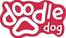
The primary doodle logo uses the first 4 letters in doodle to create the toe pads to a dog. In the logo I am using the typeface gooddog new and modified the letters to best fit within the paw print. I decided to make a border around the letters to create what I refer to as a " Sticker logo", by doing this the color of the border is reflective of the primary color of each design, and translates back to the swoop present in the dog food bags.
sample colors
Dog Food Bags

Each dog food bag is created using a specific color scheme for each flavor. The primary ingredients are showcased on the front of the page in doodle form to tie back to the doodle name. The swoop and border is used as an accent to highlight the dog, showing that dogs are the central focus of the company. This general layout is used throughout the doodle brand.
Dog Food Cans


The dog food cans run in a similar fashion to the bags with slight changes. The doodles run in a pattern along the sides of the can, and the secondary color on the can, rather than a tinted version of the primary color, is yellow on all cans to separate from the bag design and make the cans more distinct.
Variety Treat Box


I chose to add a treat box to my project for a variety of reasons. 1. To translate the brand design to another medium (choosing the box design over a bag). 2. To showcase what the brand would design in a variety setting. 3. To show how the treats can stand as its own element. The key differences from the food being that this is the only instance of showing the food and the dog on the box, as well as creating the primary focus onto one ingredient, in this instance pumpkin, which is a known food that is great in dog health.
06
Advertising


Thank You!
This project meant the world for me to create, and has and forever will have a special place in my heart.
